Kaizo's Website
UI/UX
Kaizo provides a unified, actionable, integrated Workforce Performance Management (WPM) platform for the world's largest remote-working population, customer support. It does this by giving Zendesk Users a Web app that uses gamification and AI to improve operational efficiency, individual productivity, and team engagement
As a freelance Graphic Designer at Kaizo, I had the opportunity to work in multiple projects in different areas of the company such as:
- Redesigning the website;
- UX assessment and analysis;
- Start the implementation of a design system;
- Social media Posts;
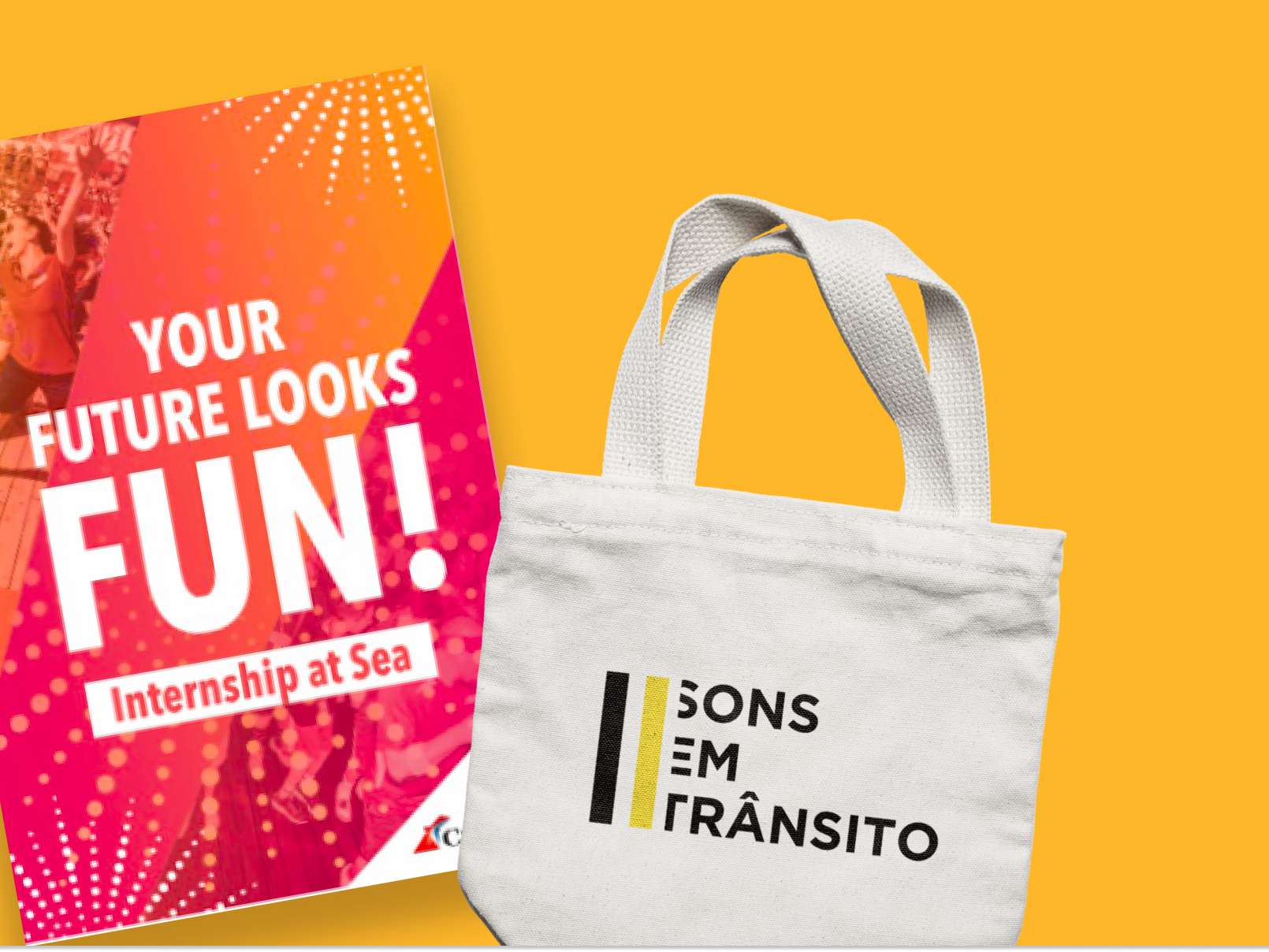
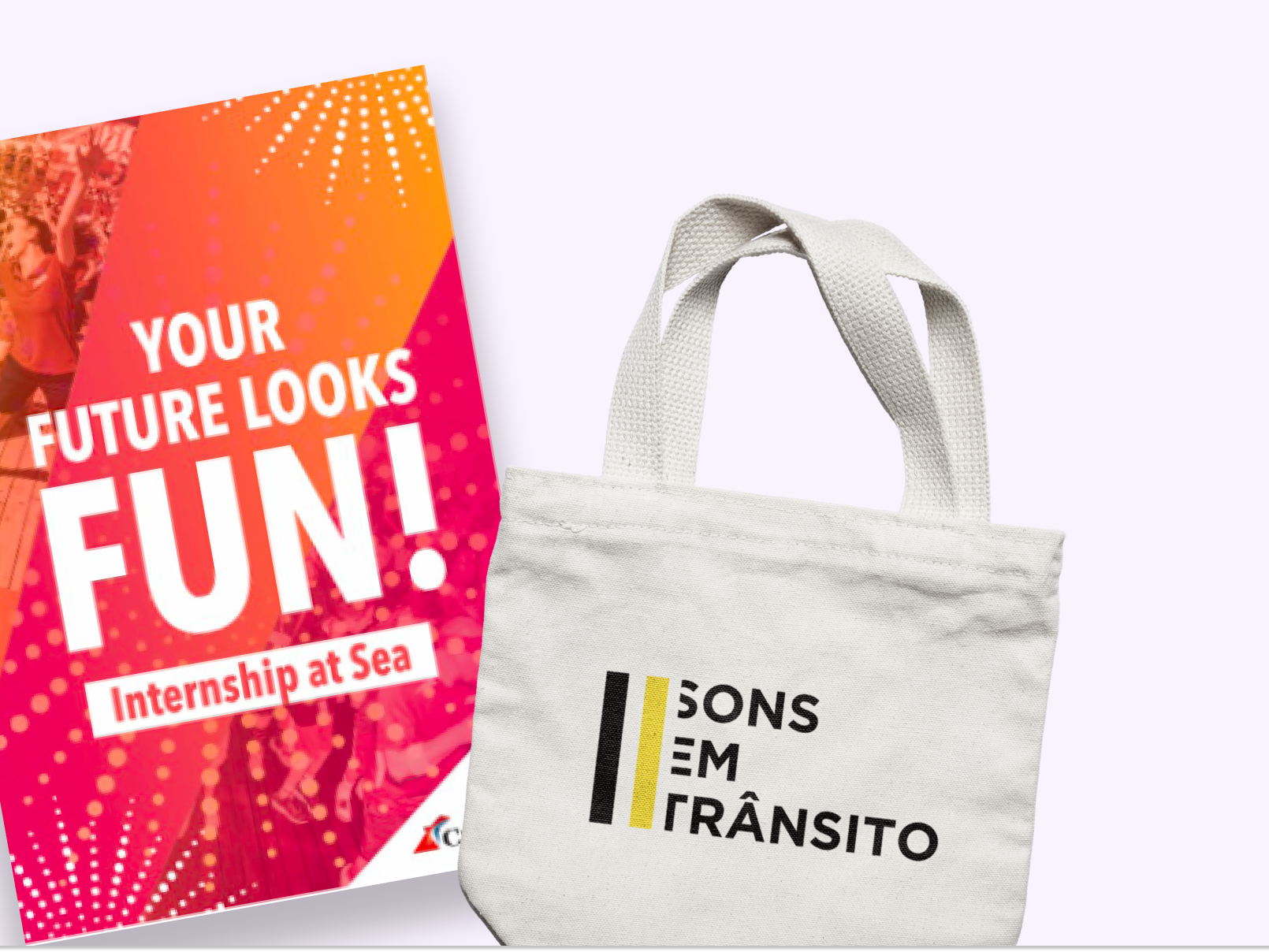
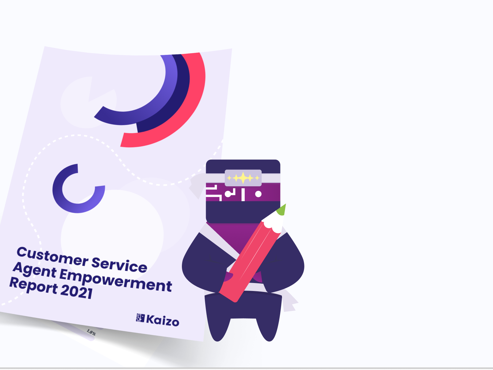
- E-books;
- Infographics;
On this page I'm covering the website redesign.
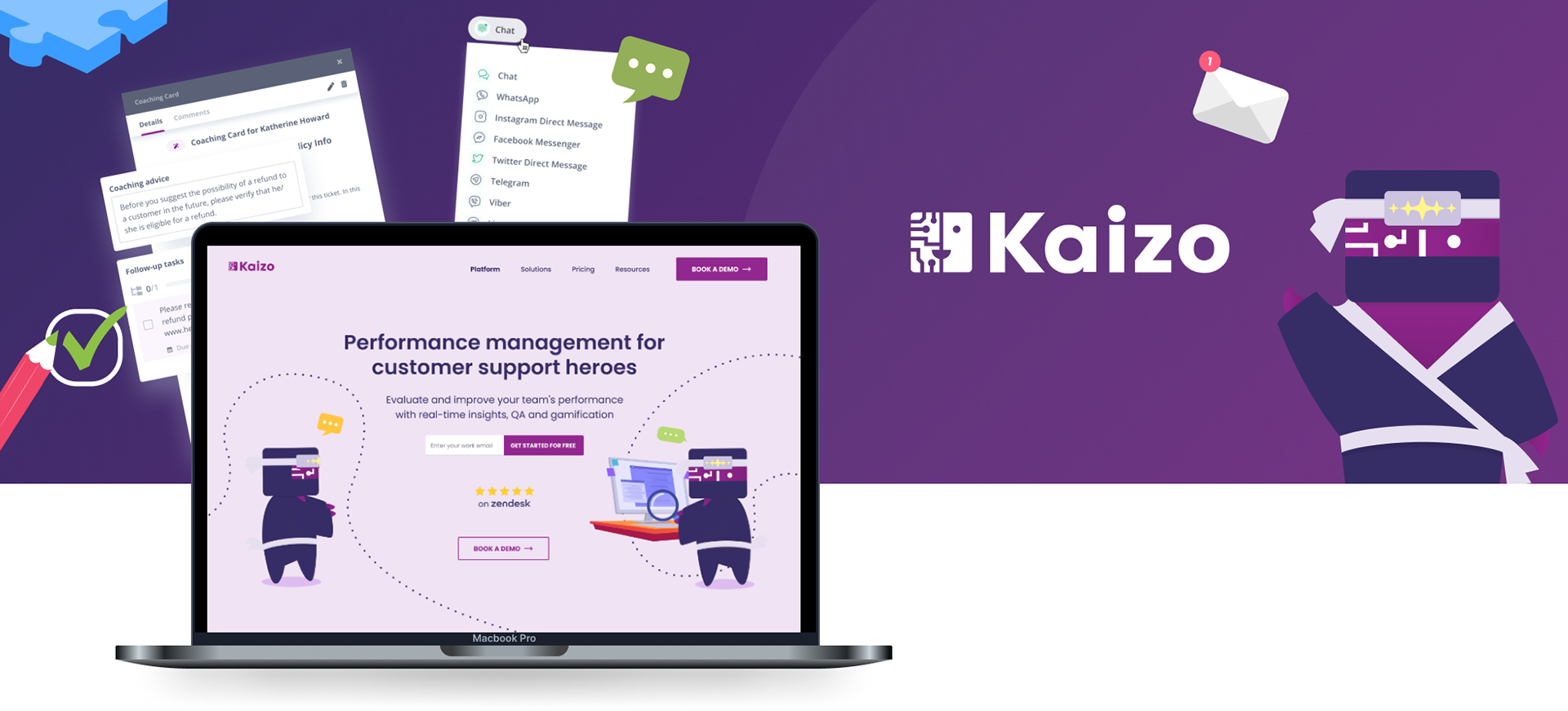
Website Redesign
Redoing Kaizo's website posed some challenges, and together with the Marketing team we decided to firstly focus on the analysis of the current website - Not only analysing the most obvious design problems but what we could improve to make sure we create an engaging and informative user journey.
Creating the website map helped to map out the current navigation problems, and tie off its loose ends. Sometimes we found out that some links weren't working or taking the user to the wrong page. Other times we acknowledged that there was an excessive amount of CTA's.
After this the marketing team identified the most important pages and the redesign of the home, solutions and pricing was started.
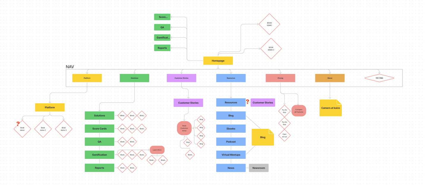
Website Map created to access all the navigation problems
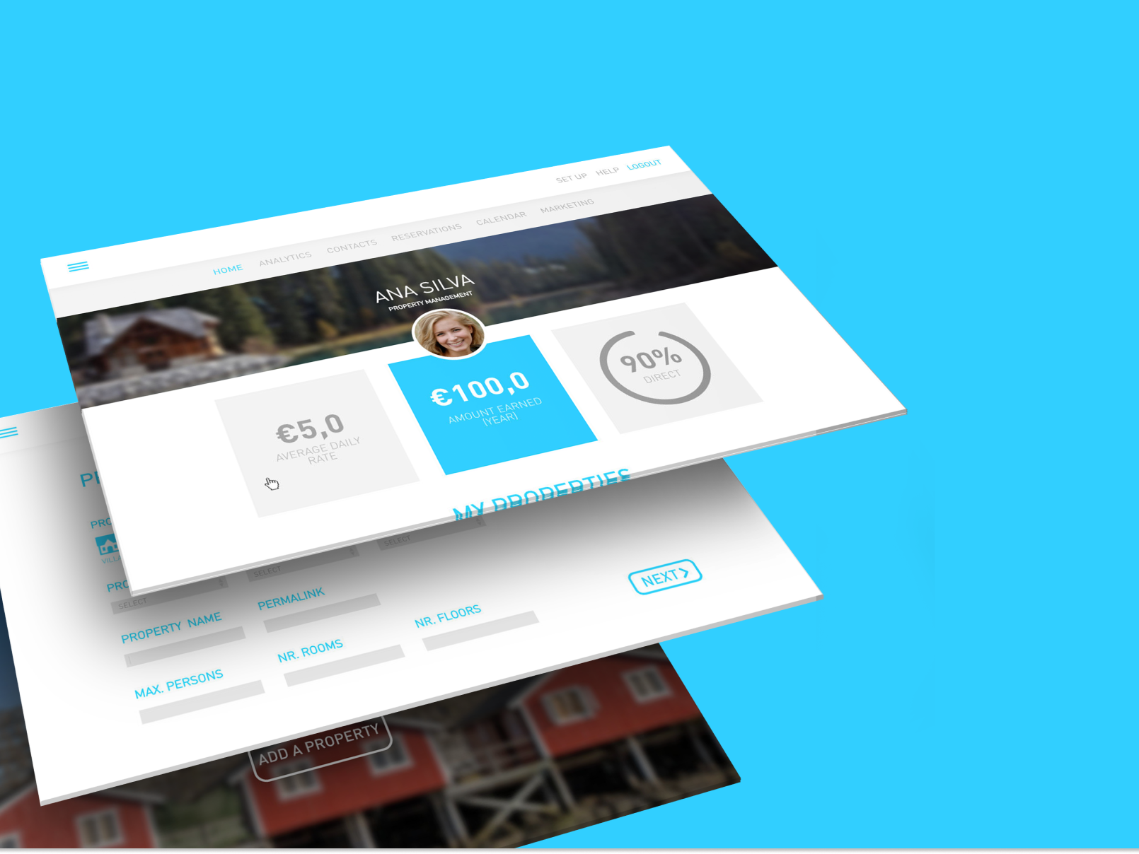
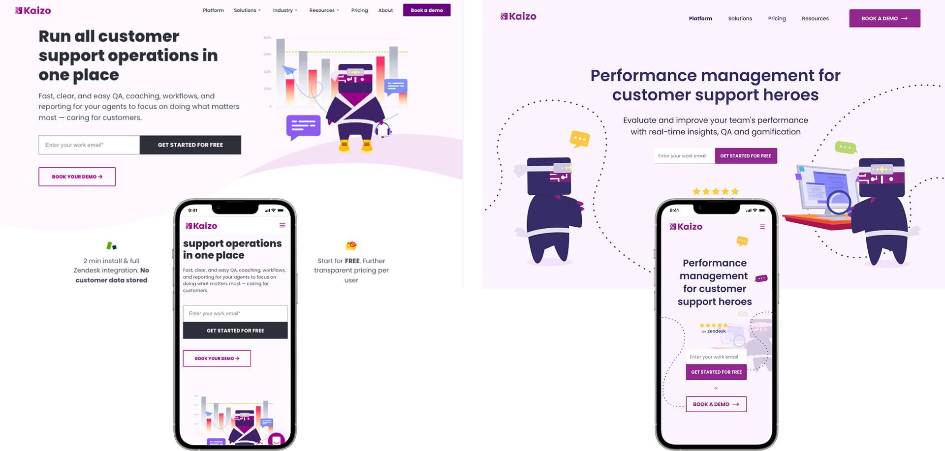
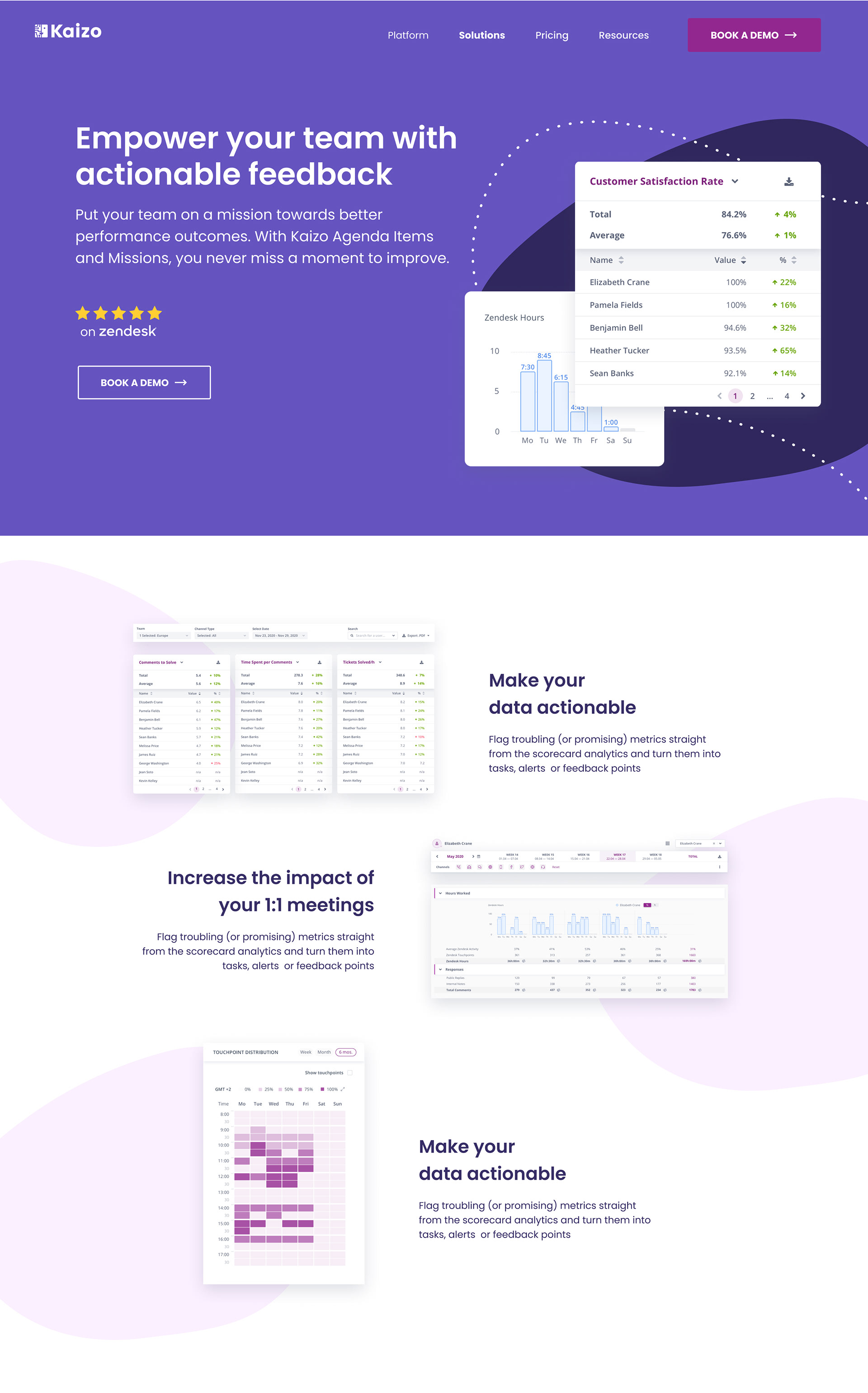
Home Page
The first page to be redesigned was the homepage. This was important to set the tone for the rest of the website and a good exercise that helped us figure out some rules we wanted to implement for the rest of the designs, like the color change of the fonts to a dark purple blue tone.
The redesigns were done on the mobile form at the same time we were developing the desktop ones, to make sure that the responsiveness didn't come as an afterthought.
Solutions Page
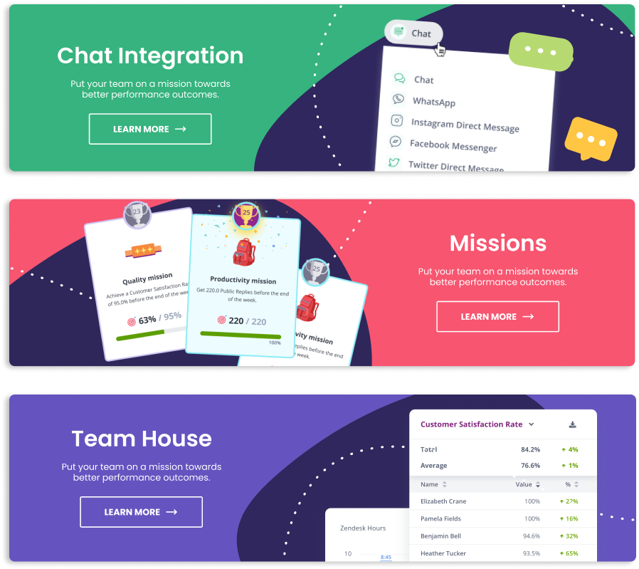
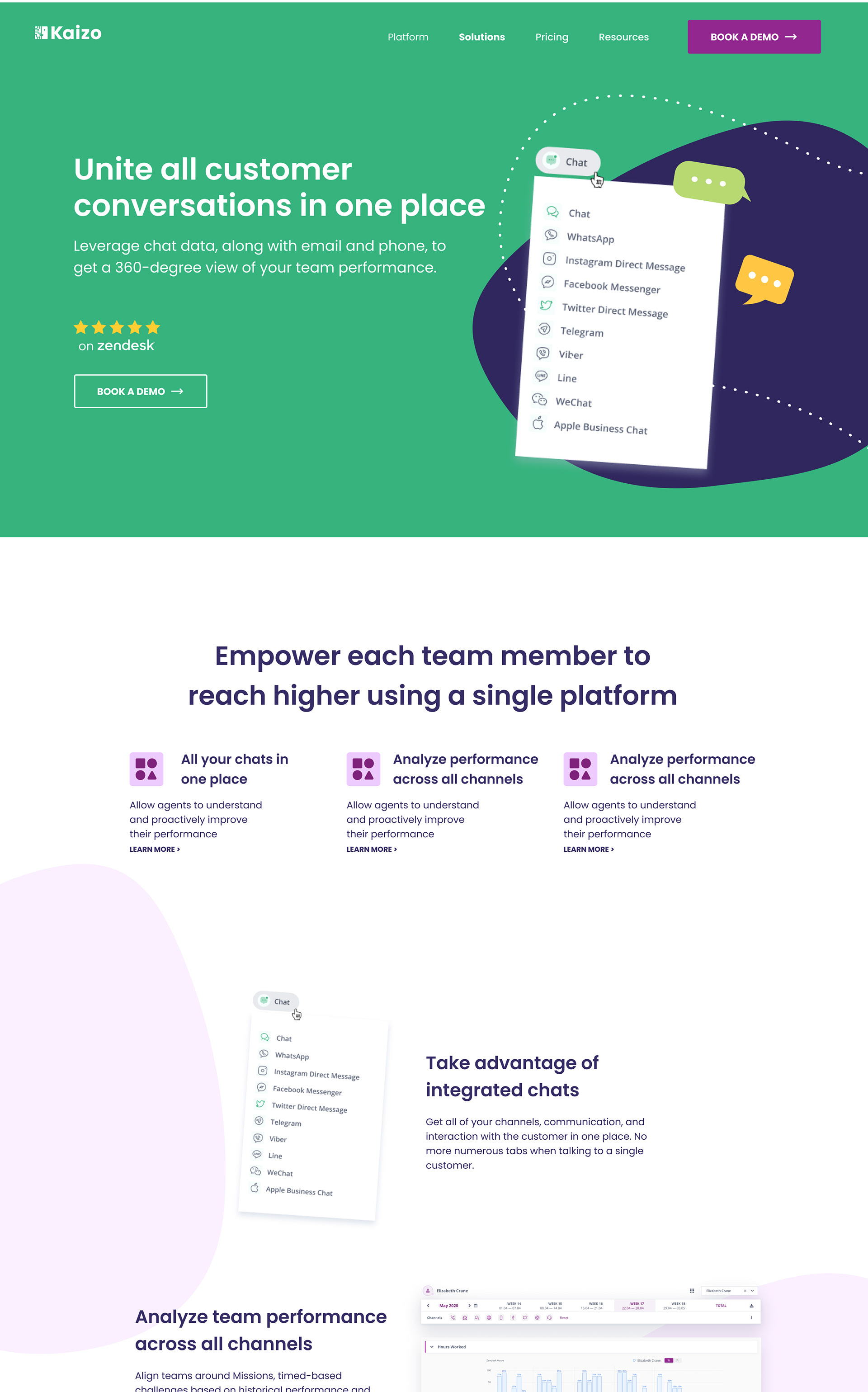
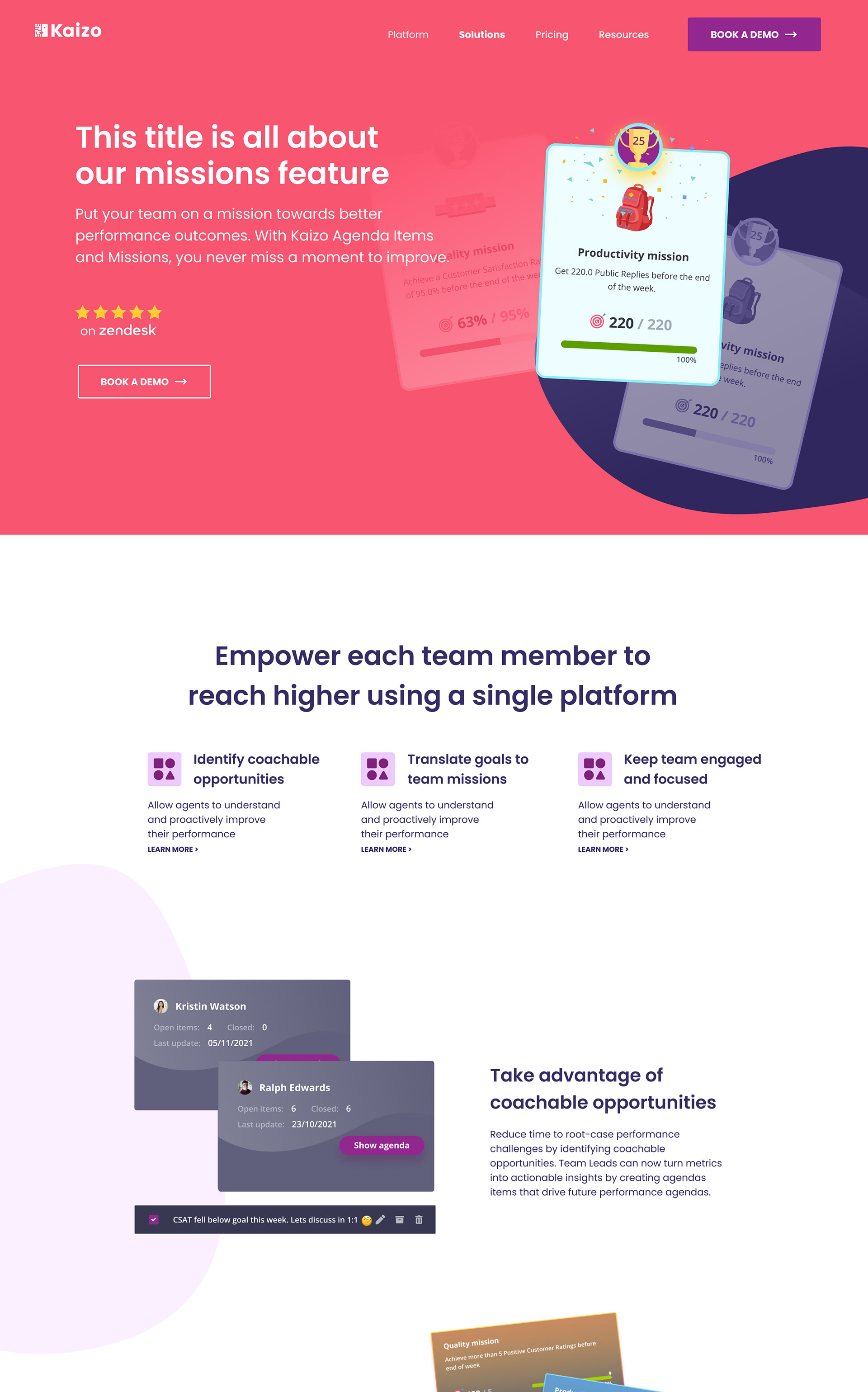
One of the areas I wanted to improve, was the display of the solutions Kaizo offers. To do that I created solution cards by assigning a specific color to a solution and adding the most recognisable UI element to it with a short description. All those cards are clickable and lead a page that explains it in further detail
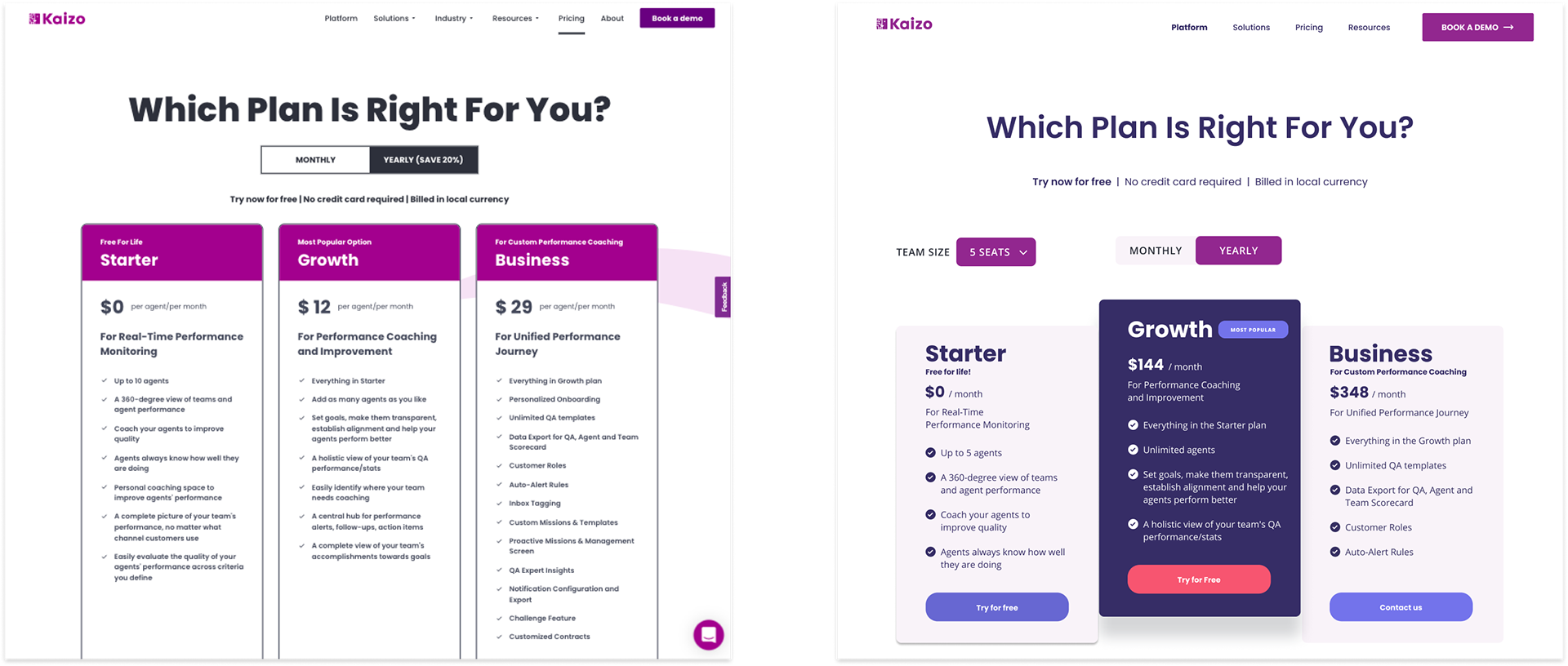
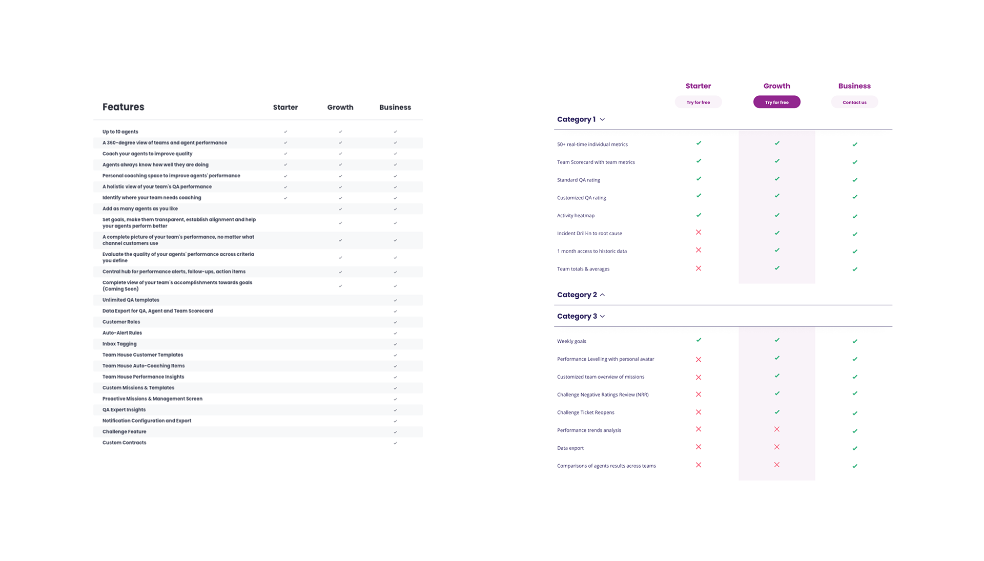
Pricing Page
The goal for the pricing page was to not only modernize it but to also concise the amount of information the user receives by cutting most of the copy to only the most important features and giving the user the power to choose if they want to learn more about the plans.
Another goal was also to make use of different colours to make sure that the CTA's popped.
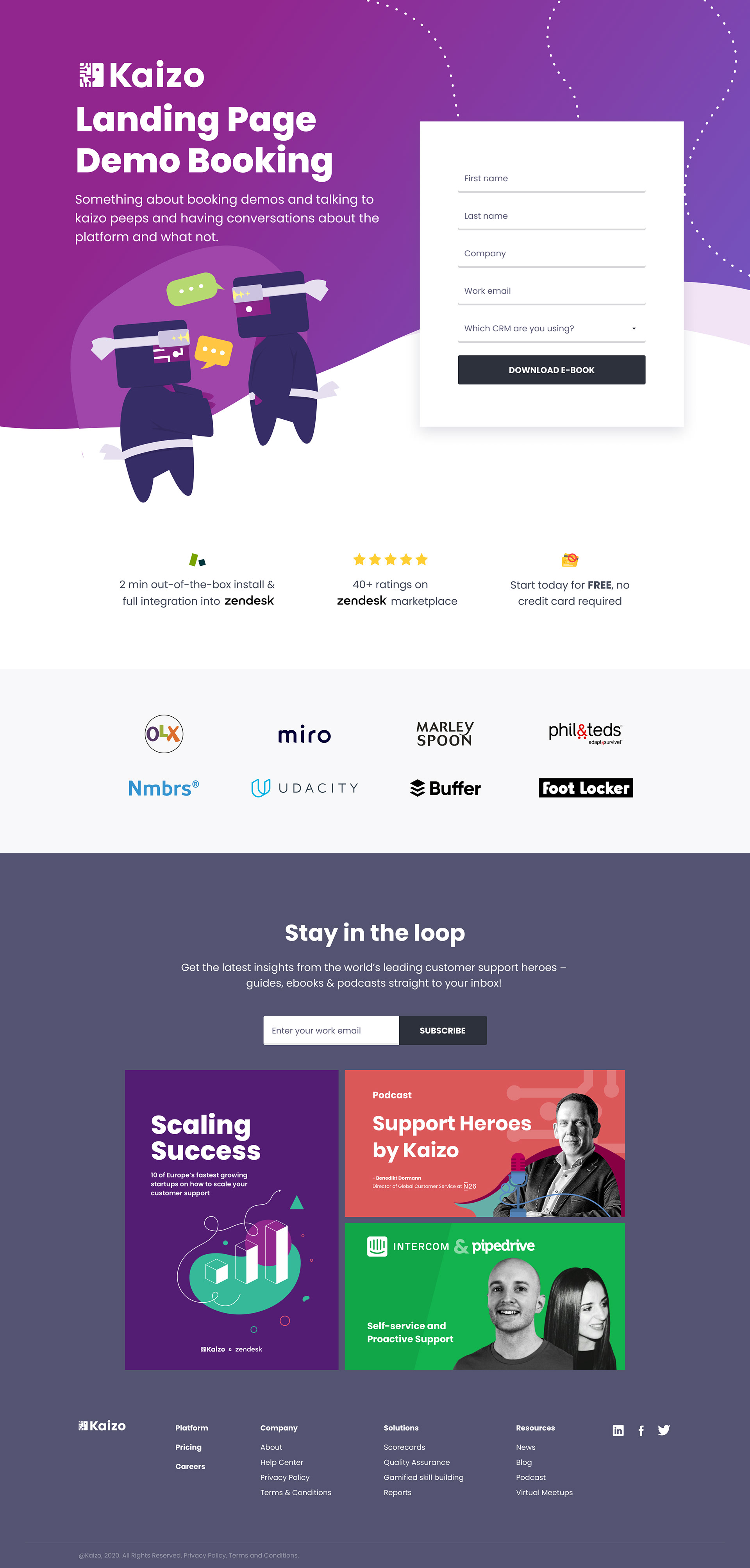
Landing Page
After completing the redesign of the main pages, it was necessary to rethink the design of the landing pages. Specially the one used to book demos.
The goal was to create something simple that features the kaizo mascots talking and that gave a simple form to fill.
The page also contains the footer that can take the user to any page or to other forms of content like the ebooks or podcasts.